Starting with a blank page
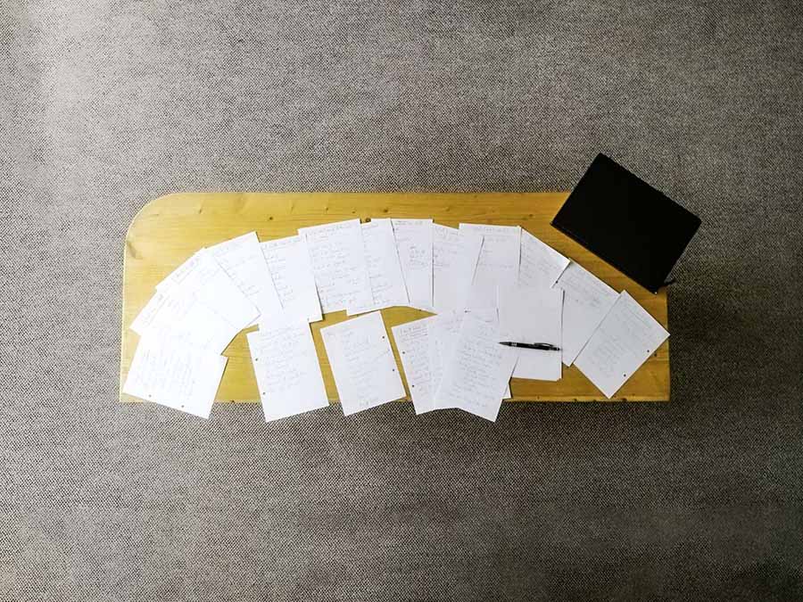
Starting a new illustration can be frustrating. Usually we know which information the image will contain, but we have to find a visual solution for the things we want to say. In this case, an illustrator’s best friend is a sketch. Small thumbnail sketches help visualize ideas fast, larger sketches give us a basis for our final illustration.
But there’s one problem I have with sketches: It’s very difficult, to disconnect a sketch from it’s content and focus purely on asthetics. That’s why I started using composition to plan my images.
Composing images for picture books
In relation to illustration, composition descibes methods for creating visually pleasing images. There are some helpful guidlines, which are used throughout visual media: The rule of thirds, the golden section, the use of leading lines, contrast in size, shapes and colours… Once artists start using and observing image composition, they will see these methods used everywhere.
Focusing our attention on picture book illustration specifically, there is one book I can highly recommend: “Picture This: How Pictures Work” by Molly Bang. For anyone starting out with illustration or wants to dive into the basics just a little deeper, this book is a treasure chest.
In the book, Molly Bang gives us a step-by-step guide to a well composed image. While these steps aren’t necessarily noteworthy by themselves, they show a process which leads to an impressive picture. And we can easily copy this process for our own work.
Guide to great image composition
Molly Bang provides excercises in her book “Picture This: How Pictures Work”, so feel free to use those as your guide. I myself didn’t enjoy the schoolish feel of the exercises. This is what I suggest, based on the content of her book:
Step 1: Decide the content
- What is the content you’ll have to show? Define what information the reader should get from the image. Is red riding hood being followed by a wolf? Is Peter Pan flying out of a window?
- What do you want viewers to feel? Is it scary, happy, angry, proud?
Step 2: Know the rules
- Try to stick to simple shapes like rectangles, squares, cirles and ovals. You can mix and match as you please. Scale them, combine them, distort them, but try not to add details.
- Use up to four colours: Black, White, Gray and one accent colour of your choice. Stick to black, white and gray if you can, but sometimes you might need that extra colour.
Step 3: Compose your images
- Choose a medium. If you have it, I suggest vector-graphics software like Adobe Illustrator. You can use coloured paper and scissors too, as Molly Bang suggests, but that is highly inflexible. Otherwise try Photoshop, Gimp or Inkscape, it really doesn’t matter much.
- What format will the final illustration have? It might be a double page spread of a picture book, or a poster or album cover. The format will have an impact on your composition, so start with the format you’ll end in.
- Start testing layouts!
By following these steps, you’ll be restricted to a very limited amount of visual options. The shapes don’t allow for detail, the colours don’t allow for lighting and texture. You won’t be able to create a bad composition and make it look good by adding stuff. The restrictions will force you to compose a good image, which is the best starting point for an illustration.
Example: Lonely Charlie
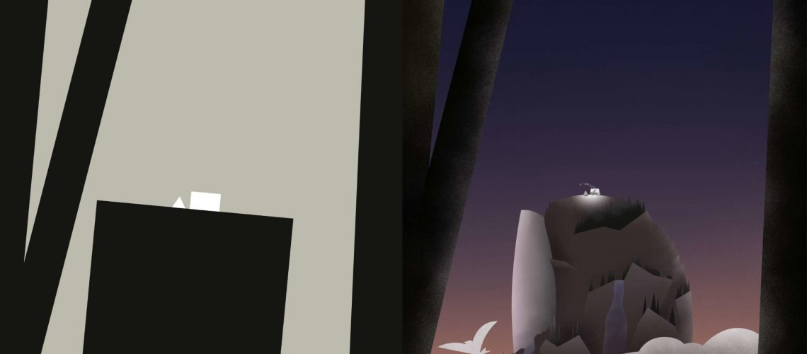
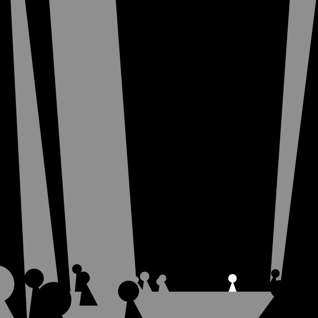
These ideas might seem abstract, so here’s an example: Charlie is lonely. He lives in a major city, but doesn’t feel connected, despite there being thousands of people around him. That’s the content and the feeling. Instead of drawing a sad character in a big city, let’s compose an image:
- Make Charlie small. We want him to feel small in comparison to the world around him.
- Place Charlie low in the image. The space above him will push down on him. We want him to feel that weight on his shoulders.
- Tilt everything else away from him. We don’t want to corner him, we want to ignore him. Tilting everything away will give him less attention.
- Make Charlie stand out. He is lonely, so make him unique to everything else. I suggest using colour for this, but you could use shapes as well.
- Make the background dark. We want to put pressure on him. Dark areas carry more weight and will add pressure.
Here is the final composition:
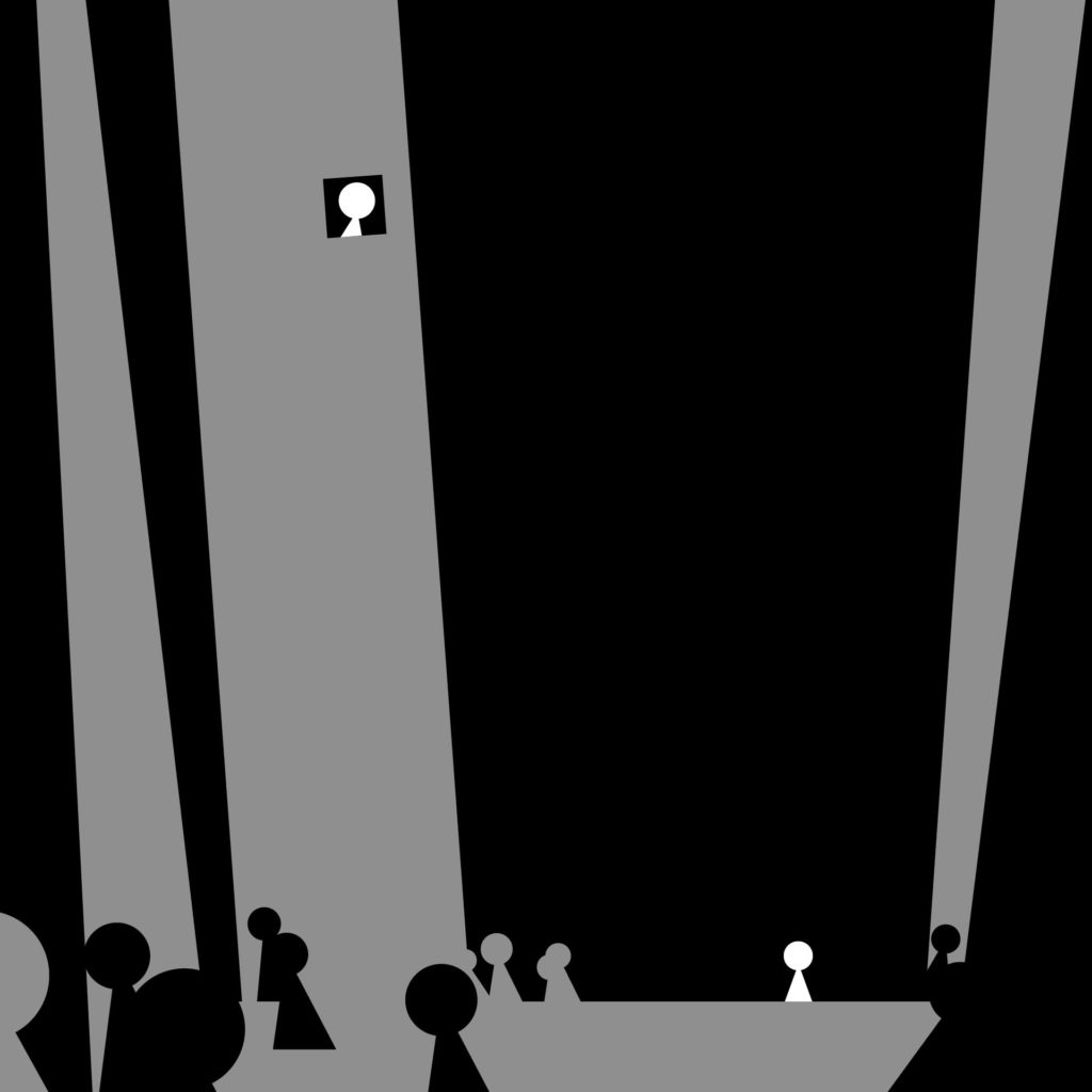
Just for fun, let’s say there’s a single person he feels connected to in this major city. Since we made him unique with his colour, we can add the same colour to connect the two characters.
Composition vs. Sketch
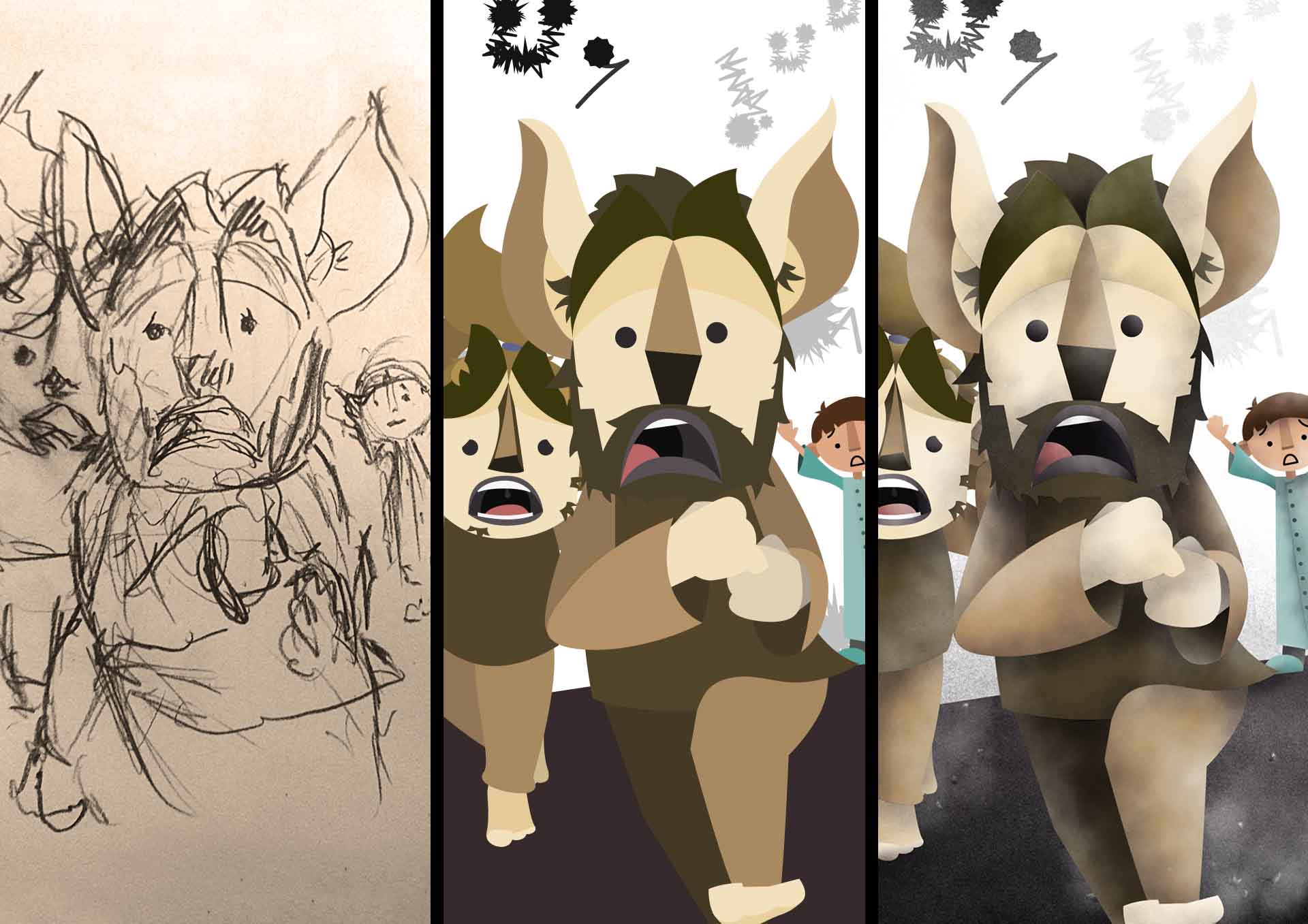
Pencil on paper is great for a lot of things. If you want to visualize your ideas, doodling, scribbling and sketching are probably the way to go. Also, for any kind of details, sketches are invaluable: Facial expressions, character poses, the little dog on the neighbour’s porch. All these things have to be sketched, there’s no point in creating image compositions for the protagonist’s face.
What image compositions are ideal for, is planning a picture. It’s like a layout for a graphic designer – it gives you a feeling for the relationship between visual elements. If you can’t seem to get any emotional response out of your illustration, despite every detail being perfect, it’s probably your composition’s fault. Follow the steps above and arrange your objects in a way, that makes the image tell a story, even without detail. Being limited to simple shapes prohibits us from adding details and lets us concentrate on something much more important: feelings.
So next time you find yourself stuck in details or frustrated by a tiny sketchbook, open up Illustrator and create some shapes, It might help you as much as it has helped me.
